
Have you ever thought about having contrasting colours in your kitchen? A contrasting colour for your countertop is a classic combination that will add design value and be perennially popular for future buyers.
Why choose contrasting colours?
While the minimalist of kitchens will keep a singular colour, usually white or pale tones, to maintain those clean lines. Choosing a contrasting kitchen breaks up the space and can add flair and punctuation to your kitchen. A natural wood kitchen, with a shiny white Corian quartz collection worktop will highlight the wood beautifully.
A contrasting colour kitchen is able complimentary colours and tones, and the elevation of each of the colours chosen. Well chosen contrasts can create a real sense of space in your kitchen.
Delicious colour combinations to consider
- Bright white worktops and dark indigo cupboards – for the light and bright kitchens with a modern vibe.
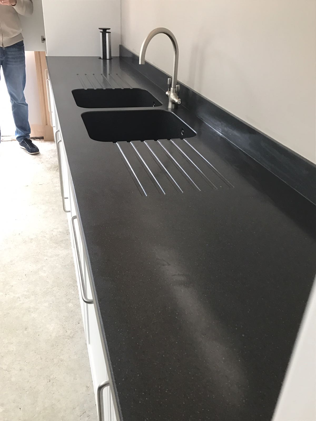
- Charcoal grey countertops and white cabinetry – this classic combination is perfect for busy homes.
- Pale blue shaker cabinetry with warm stone effect Corian work surfaces – creating earth and sky within your home.
- Matt black cabinetry and a shiny pinkish toned quartz worktop – this whimsical combination contrasts both colour and texture.

See our products, colours and inspiration!
